Tuesday, April 26, 2016

Should We Take a Look Inside? - process notes


My newest poster, "should we take a look inside?" is currently on sale here for 24 hours at Bottleneck gallery. After the sale ends on Wednesday, April 27th a t1 pm EST., the edition size will be based on how many sold and they will never be reprinted! While the sale is going on, I figure I'd share a peek into the process of how I made this poster.


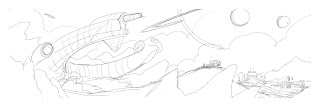
As always, I started off with a series of small pencil sketches and chose the one I liked the most. I was really interested in featuring the derelict space ship, since most of the time that really awesome looking ship is far away in the background, rather than right up front.


After choosing the little pencil sketch, I drew it again to tighten up the composition. I like to start with a strong pencil sketch since I already spend so much time moving elements around while I work on the final.


Next up, I color the pencil sketch digitally. I try to make most of my final color decisions at this stage because the first question the printer will ask me when I go to book the time on press will be, "How many colors is it?" For this particular print, I was having a lot of trouble locking in my final color choices, so I posted this image on my facebook group and let them vote on it.


I also roughed in my idea for the glow in the dark image. I have to know what the glow in the dark will look like while I work on the piece because the ink will only glow if it's placed on top of the lightest areas of the image.


Depending on what I feel like drawing that day, I'll either start on the foreground and work my way back, or start on the background and work my way forward. I felt like drawing clouds, so I started on those first.


I got excited about the idea of the terraforming of the planet taking place in the atmosphere. The oxygen rising up from the terraformers in the ground, forming clouds and then bleak, airless space above the cloud layer.


I shifted focus to Hadley's Hope and one of the terraformers on the horizon. I also started to rough in some mountains.


Here's Hadley's Hope after finishing up the details and shading. You can also see here that I hid my kid's names on the buildings. I drew each mountain individually so I could shift them around if needed... which was a good choice as I wound up moving the mountains all around before I was finished.


Hadley's Hope after another details pass. Adding some lights here and there and one of my Facebook group members insisted I include the iconic "BAR" neon sign.


Newt's family and cool truck. Getting the silhouettes just right is real important as these figures will be extremely tiny. I spent a lot of time trying to get the family looking excited about finding this alien vessel and getting rich off their discovery, contrasting Newt's wariness... all communicated without any facial expressions, just body language.


At this point I decided it was time to get serious about drawing the derelict. I wanted to get the feeling of looking up at a huge monument or a natural wonder. Drawing a curved, horseshoe shaped object from this perspective was not the easiest, but I was happy enough with the drawing to scan it in and apply some lighting to it. I also drew all the little tubes and details on a separate layer, so that if I accidentally painted over any of those little pieces, I could easily bring them back.


Now that I had all the major elements roughed in, I quickly did a pass on the foreground rocks so I could get an idea of how it was all coming together. I was fairly excited about how it was looking, but I had some major issues that needed to be worked on...


First, the sky needed to be chucked out and started over from scratch. The clouds looked nice and all, but they just were not working for the piece overall and pulled the viewer's eye down towards the bottom of the print. The background mountain range was also having a lot of issues, the main one being the "wind" above Hadley's Hope just forcing your eyes right off the edge of the poster. I moved the largest mountain in front of that wind shape to block that from happening and bring attention back down to the colony. I also moved the ringed planet and the moons over to the right side of the image to frame the derelict.


This is my progress on the derelict detail. I'd basically just start with rough lighting, then fill that in with my purple color and pick out the little highlight details with blue. While working on this, I decided to sit and watch Aliens again to see if I missed anything... and good thing I did as I realized I missed something HUGE. Between Alien and Aliens, the derelict had cracked and half collapsed. Newt's mother and father even enter through the cracked open hole in the ship! Luckily, it was a fairly simple fix, cut the piece of the ship off, rotate it so it's resting on the ground and draw a gaping hole where the ship cracked open.

After the derelict was completed, I sat down for an afternoon and drew out all the rocks in the foreground, added some more rocks behind the derelict, a bunch of fog and voila!


The major elements are all in place for the glow in the dark layer already... all I had to do was sit for a couple hours, put on some Iron Maiden and draw fire, smoke and lightning. I figure the Queen must have grabbed onto the ship as it was leaving and pulled herself in before the colony exploded.


Game over, man! GAME OVER!

Should We Take a Look Inside?


My latest print, "should we take a look inside?" is 12x36, 7 colors, printed on black paper and it even glows in the dark!


This poster is a 24 hour timed release through Bottleneck Gallery in collaboration with Acme and FOX for Alien Day, 4/26, starting at noon EST! The edition size will be determined by the number of posters ordered in that time period. You can buy one here!


There's also a limited edition variant, with a run of 225 and a green color scheme, also on sale today:


In honor of Alien Day, I wrote up a little something about my first exposure to the Alien franchise. The first of the movies I saw was Alien 3, in theaters with my Dad... but I was hooked on Alien years before 3 was released.


I’m pretty sure the year was 1988. I'm 8 years old and my father has taken me along on another museum visit. It was a regular activity for us, some weekends we’d even museum hop from The Los Angeles County Museum of Art to The Norton Simon Museum if they both had something interesting on display. What was unusual about the outing, this time to an exhibit about movie magic special effects at The Museum of Science and Industry in Downtown LA, was that upon entering I was greeted with a little TV on the floor, blaring the phrase, “Get away from her, you bitch!”


Aside from the out of place vulgarity, I was captivated by the images on the small screen. The scene was terrifying, a tough looking lady in a robot suit traded blows with what looked like a giant spider-dinosaur. I couldn't focus on anything else until the giant black bug got sucked out of the airlock into the black void of space and the clip ended.


When I looked up from the tiny television, I saw my horror made flesh. Both the full size Alien Queen puppet and the Power Loader props were towering over me, frozen in eternal combat, a clothed mannequin in place of Ripley. I stood in awe, enraptured for what seemed like hours, but it was probably just a good ten minutes before my Dad and I made our way through the rest of the exhibit, left to grab some dinner at Crocodile Cafe then made our way home.


I feel like some part of me is still standing there, looking up in terror-stricken astonishment.

Thursday, October 29, 2015

You Ain't Never Had a Friend Like Me


My latest poster, "you ain't never had a friend like me" is 12x36, 11 colors including metallic inks, printed on black paper and was released with Cyclops Print Works on Oct. 16th. It sold out immediately, but I will have a few personal copies available this Friday, Oct. 30th through Bottleneck Gallery.


The first idea I pitched was to have a bunch of the different celebrity forms erupting out of the lamp, with Genie coming out at the top. I was excited about showing the range of Robin Williams, but in the end I found all the caricatures to be a distraction rather than a fun nod to Robin's talent.


I whipped up another color sketch, this time focusing primarily on Genie emerging from the lamp. While working on this I stumbled on the idea of hiding Jasmine's face in the smoke and I was glad to keep the recurring theme of the hidden love interest going with my Disney poster work. This concept got approved and I started drawing.


I started work on the figures, since that is usually the most fun part. Here's a mostly finished Aladdin, with Apu blocked in with solid color, no rendering.


After I rendered Apu, I blocked in the solid shapes for the magic carpet... which took me quite a while. I knew a lot of the details would be covered once I added shade to the carpet, but I need to start with an accurate under drawing before I render.


Now that the three characters along the bottom are finished, it's time to get to work on all the Genies and the smoke.


I toyed with having the genie figures lit bright pink from underneath, to match the scene in the movie. Once I started drawing the smoke, the pink just looked weird so I changed it to blue.


As with most anything I draw, I roughed in a solid shape for the smoke and then went back in and added details. With smoke and clouds, it always takes several passes of detail, adding and taking away, so I can get that solid yet wispy feeling. After I finished the smoke, I sat and drew tons of little sparks and magic dust type stuff all over the place and bam, I was done!


I'm super proud of this piece and it meant a lot to me to have been given the chance to pay tribute to not only a seminal movie from my childhood, but a seminal entertainer throughout my life, Robin Williams. We won't ever have a friend like you again, Robin...

Tuesday, July 7, 2015

Barbasol Jurassic World cans


(placeholder text)

(placeholder text)
 
You may have noticed my latest release on store shelves nationwide! I worked with Universal Studios and Barbasol to make a series of limited edition Barbasol cans that feature dinosaurs from Jurassic World! I'm honored to be a part of it and can't thank my collaborators enough. The printing team did an amazing job on these and even won the Award of Excellence Award from the International Metal Decorators Association!
 
 
You can find these anywhere they sell Barbasol shaving cream in the USA, so exciting and surreal to see my work on store shelves.

Monday, March 23, 2015

emerald city comic con

My newest print, "pawnee national park", is 18x24, 6 colors(neon yellow and oranges, with a metallic light purple) run of 225 and will set you back $50. There's also a variant edition:

The variant is printed on a natural stock paper, is a run of 75 and will set you back $75. There's also going to be small edition of 30 variants printed on some nice,  1/2” Baltic Birch Plywood which will set you back $150.

One more!

"the legendary dewey cox" is 18x24, 2 colors(including metallic gold) printed on black paper with a run of 50 and will cost $30.

All of these will be on sale sometime tomorrow, the 24th, over at Bottleneck Gallery. I'll also have copies of everything but the wood variant of "pawnee national park" this weekend at Emerald City Comic Con! I'll be at table D-18, which, looking at the map, is somewhere around here:

Looks like I'm conveniently placed near some bathrooms. So, let's be thankful for that! I'll be there all day, every day of the show, although I am tentatively scheduled to be at this panel on Friday:
Rewriting History: The Next Chapter of Heavy MetalRoom: Hall E (TCC 303)Date: Friday, March 27thTime: 4:50PM - 5:40PMNearly 40 years after its American inception, Heavy Metal remains the world's leading illustrated science fiction and fantasy magazine. Now, "under new management," the brand moves into new territory in music, film, and traditional comics publishing. Join co-CEO Jeff Krelitz, along with surprise guests, as he announces upcoming projects, plans for further expansion, and a strategy to change the game on creator-owned work in comics publishing. With exclusive news to Emerald City attendees!
At my table, I'll have some older prints I've raided from my flat file for sale as well. First come, first serve. I'll be accepting credit cards, good old fashioned cash money and I'll even take Republic Credits! Looking forward to seeing you there!

Thursday, February 12, 2015

Springfield Gorge - process notes

My latest print, which will be a 24 hour, timed release starting tomorrow at 10am PST over at Dark Ink Art. It's titled "Springfield Gorge" and is based on The Simpsons, season 2 episode, "Bart the Daredevil".

The first step was to get the general idea approved. I did a quick pencil sketch of what I had in mind, and I wound up pretty much following it exactly. I knew I wanted Homer jumping the gorge, and for him to be as small as possible so I could focus on the beauty of the landscape.

I scanned the pencils in and did a quick color pass, just to make sure I could pull this off without using too many colors. I also wanted to give the general vibe of the piece. After the pencil and color sketches were approved, I moved on to what I knew would be the next point of contention. Drawing a small Homer, with a limited number of colors to work with and staying on model.

I drew this out in pencil first, scanned it and shrunk it down the size I needed. I initially went with a more worried pose, which I later changed to triumphant. The colors are all from the color sketch and I knew that I could use them to build the rest of the image. I included the quarter for an easy size comparison and sent this off for approval.

Once I started building the pieces of the image, I realized it would be funnier, as well as just more pleasing to look at in general, if I went for an inspirational vibe. Homer at the crest of his arc through the sky, convinced he is going to land this amazing jump. Extreme optimism in the face of embarrassing, painful failure is a favorite theme of mine, so I decided to pursue that as I moved forward with this piece.

Here, I have all the foreground elements in place. I had done a pass on the clouds as I had them in the initial sketch, but, a beautiful sunset I saw driving home one day inspired me to ditch those and start over. I really wanted this to feel like some inspirational poster you'd see hanging in an unemployment office with "Reach for your dreams" printed in big type underneath it and I felt like beautiful clouds, almost as if the heavens were pushing Homer towards his victory, were my ticket to conveying that feeling.

I was a bit worried that I was maybe a bit too effective with the uplifting vibe, so, before I sent this off for final approvals, I wanted to diagram out Homer's trajectory so there wasn't any question that the image was holding true to the source material. I sent this along with the final and it was good to go!

I'm stoked that I got to do this poster. If I have my way, I'll get to do some more focused on different episodes. It'll probably depend on how this first one does, so, be sure to grab one if there's another episode you'd want a poster of!

And another thing! How come I can't get no Tang around here?